This project came at a rough time for me. My capstone project and internship were both coming to a head at the same time as this, so I wanted to do what I could to make my final project here something I could enjoy working on – easing the burden. The project’s prompt was to make something using any two of the previously used prototyping methods, plus a video. I was hoping to make something using the laser cutter and 3D printer, but was stressed to the point that I couldn’t come up with anything interesting to do with them.
Enter Derek, the Project Manager of my capstone project. He expressed some dismay that he had the basic idea of a project for the laser cutter and 3D printer, but nobody to work with to flesh it out or divide up tasks. I was already on board to partner up before he told me his ‘I-can’t-believe-I-didn’t-think-of-that’ idea of making a board game.
Research
Neither of us had created a board game previously, so we started by searching the internet for inspiration. There are many excellent board games out there, as well as sites and communities devoted to people airing ideas for new ones.
We came across an idea for a cooperative airport-themed game on a site called Board Game Designers Forum. The idea was for a two-player game where the players tried to get the airplanes sequenced and ready to take-off from an airport. We liked the idea of a hex-tiled two-player airport runway game, but we wanted to use this as the basis for a game of our own design.
Design
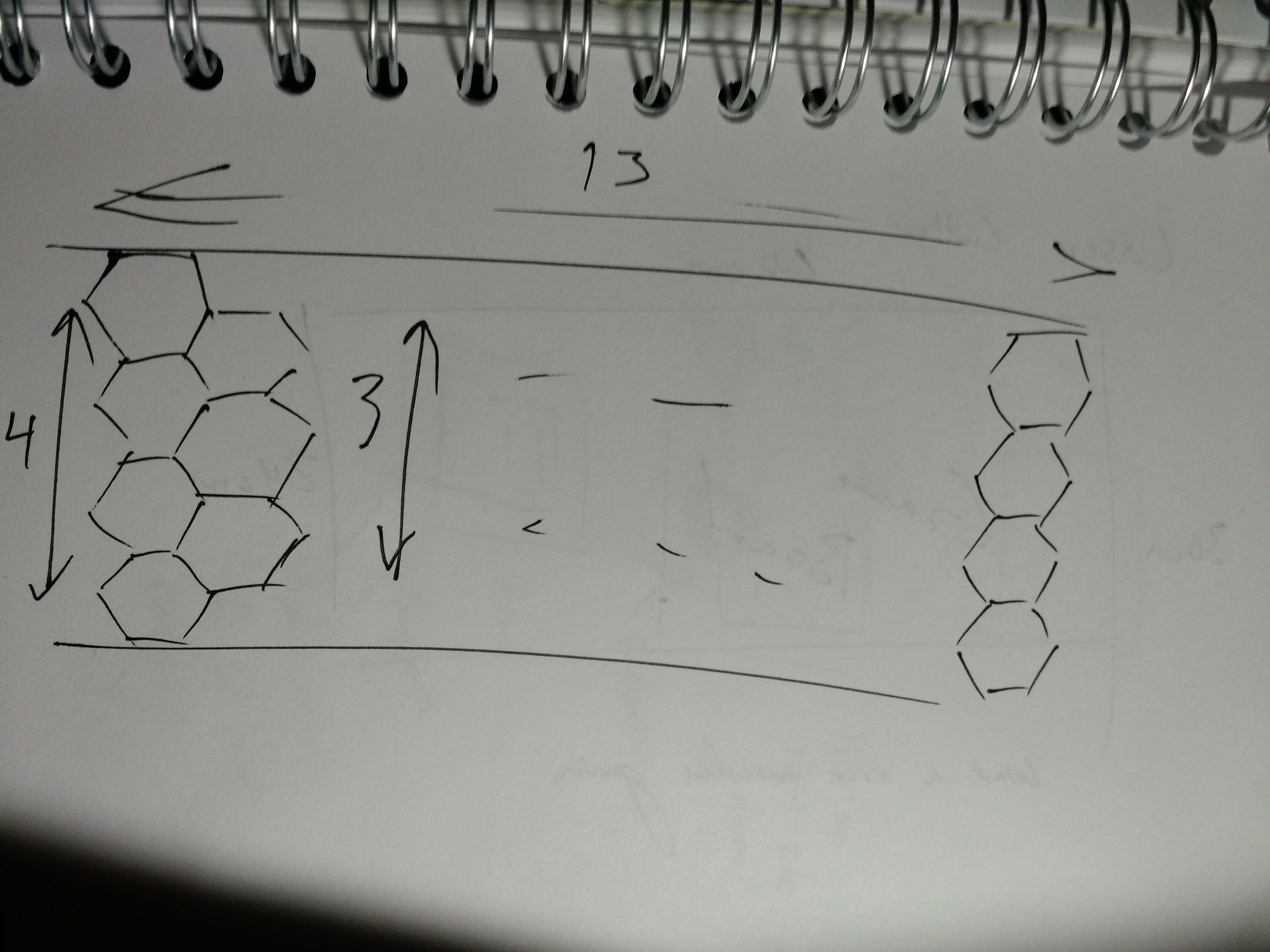
We started by generating sketches of what we wanted the game to look like. Using the premise of a runway-themed two-player game, we created the hexes.
We began by creating the general shape of the runway with hexes. Since it needed to be longer than wide, we quickly sketched out a board 13 hexes long and 4 hexes wide. We decided that instead of a cooperative game, this would be a two-player head-to-head game, with one player taking one end of the runway and another with the other.
The most imperative maxim that we held when we designed Ground Control (as is the case when designing games in general) is to preserve balance. Players cannot have such a one-sided game that victory is unattainable or unexciting. Furthermore, the game must be quick-paced enough to not become boring, but long enough as to encourage strategy.
Our two favorite board games are Ticket to Ride and Settlers of Catan, and we were heavily-influenced by their dimensions of strategic resources, building the edges of the hexes (Catan), and ticketed point-to-point connections (Ticket to Ride) among other aspects.

In Ticket to Ride, players try to accrue the most points by connecting cities with railroads. They collect points by the rail laid, but also by connecting specific cities together. These objectives are given by random cards, or tickets. We designed Ground Control’s tickets to behave similarly, in that the number points are equal to sum of the required resources.
Settlers of Catan scores by having the most settlements, longest road connections, and other point-scoring schemes. In Catan, players connect to resources by having settlements on the vertices of resource hexes, and these are connected to other settlements by hex-edge-long road segments. Unlike Catan, we felt that having every hex be a resource would be overloaded in Ground Control. We simplified the resource collection by only requiring a truck connection to the end of the runway, eliminating settlements, and having only certain hexes be resource spaces.
Ground Control Rules
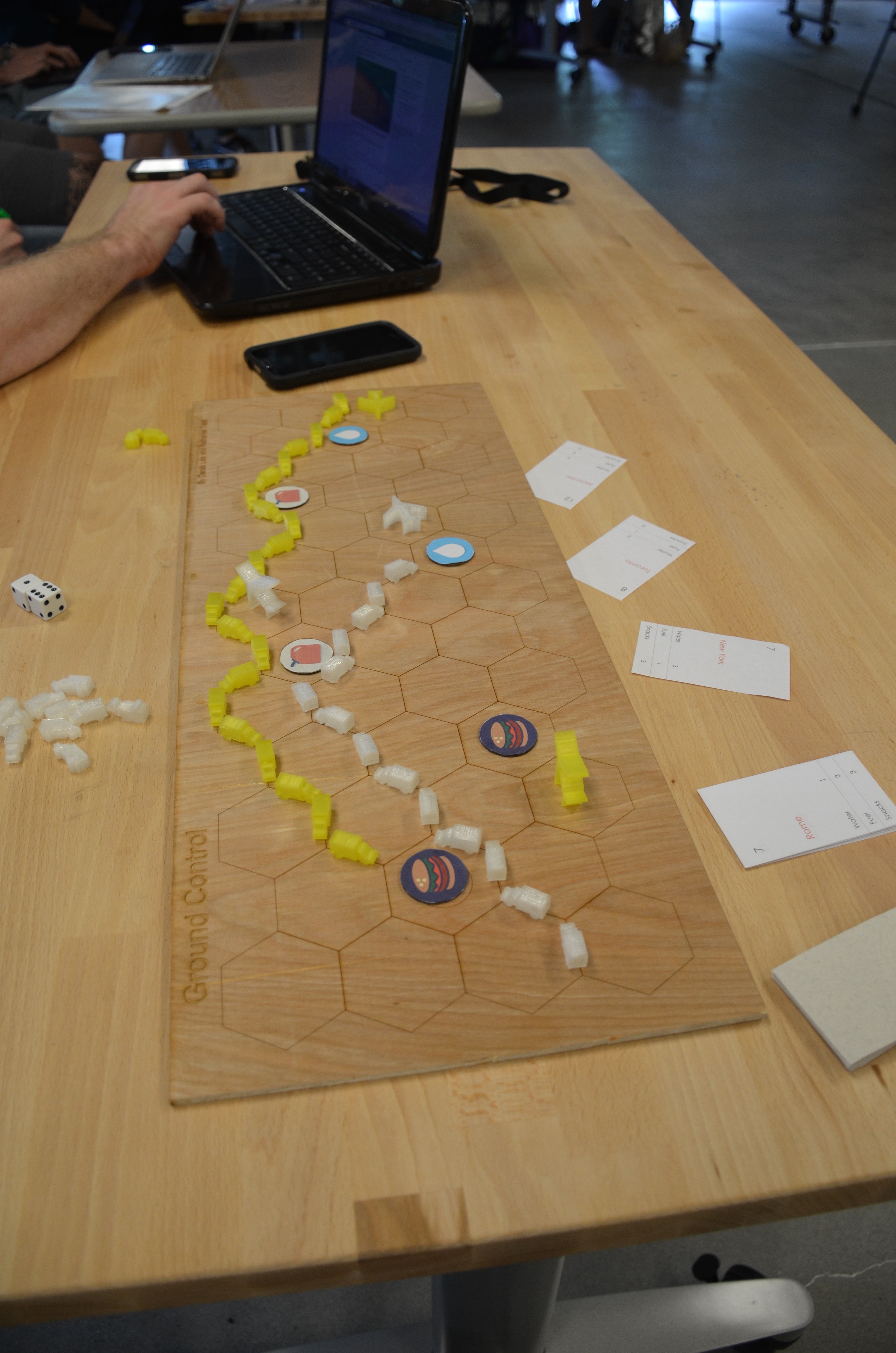
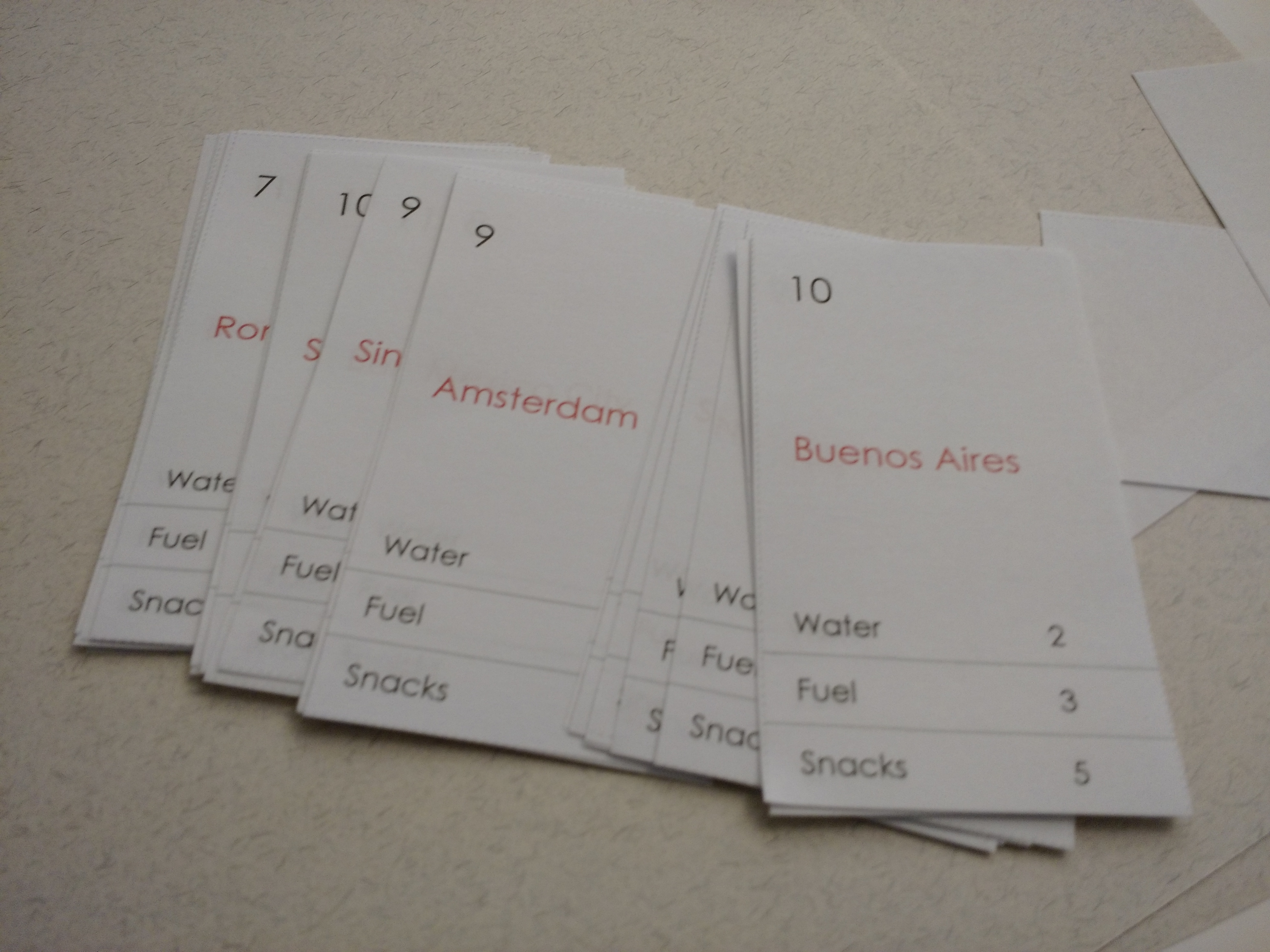
Ground Control is the name of my final project for this course. It is a strategic two-player board game where players try to be the first to 25 points by completing randomly-assigned tickets. Individual tickets have point values between 7 and 14 points.
In order to complete a ticket, players must move one of their two airplane tokens from hex to hex to the other side of the board, where the plane ‘takes off’. However, tickets require specific resources to complete: fuel, water, and snacks. Each resource must be collected by players from one of the six specific resource spaces. Players can collect from a resource spring only if they have a line of supply trucks (total of 24 per player) running along the edges of the hexes connecting from the spring to their end of the runway.
Each turn, two six-faced dice are rolled. The player may either:
- Move trucks along the edges of the hexes equal to the sum of the numbers on the dice
- Collect one resource from a connected resource space
- Move planes equal to half of the sum of the numbers on the dice, rounded down
- Draw three tickets cards and keep at least one
At the beginning of the game players randomly draw three tickets and must keep at least one, though they can elect to keep two or all three. Resource spaces are located evenly on the board, but the space’s specific resources are randomly assigned at the beginning of the game.
Ground Control forces players to exercise strategy. Users may move planes too vigorously to find that they don’t have the resources to complete the tickets. Too ambitious tickets may be drawn and player neglect their resources or plane movements. Conversely, too many conservative, low-point value tickets may require more plane movements.
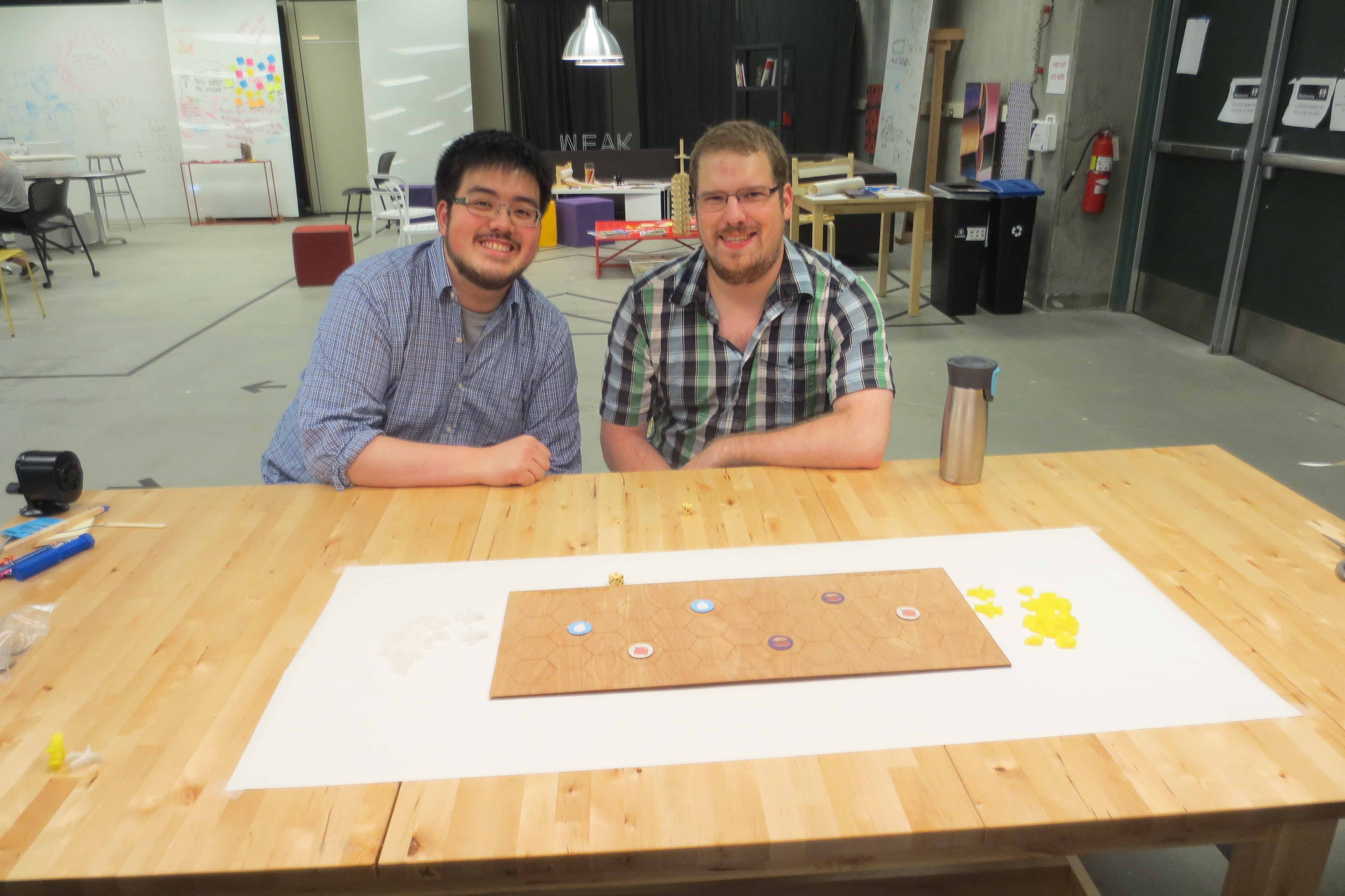
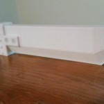
Laser-Cut Game Board
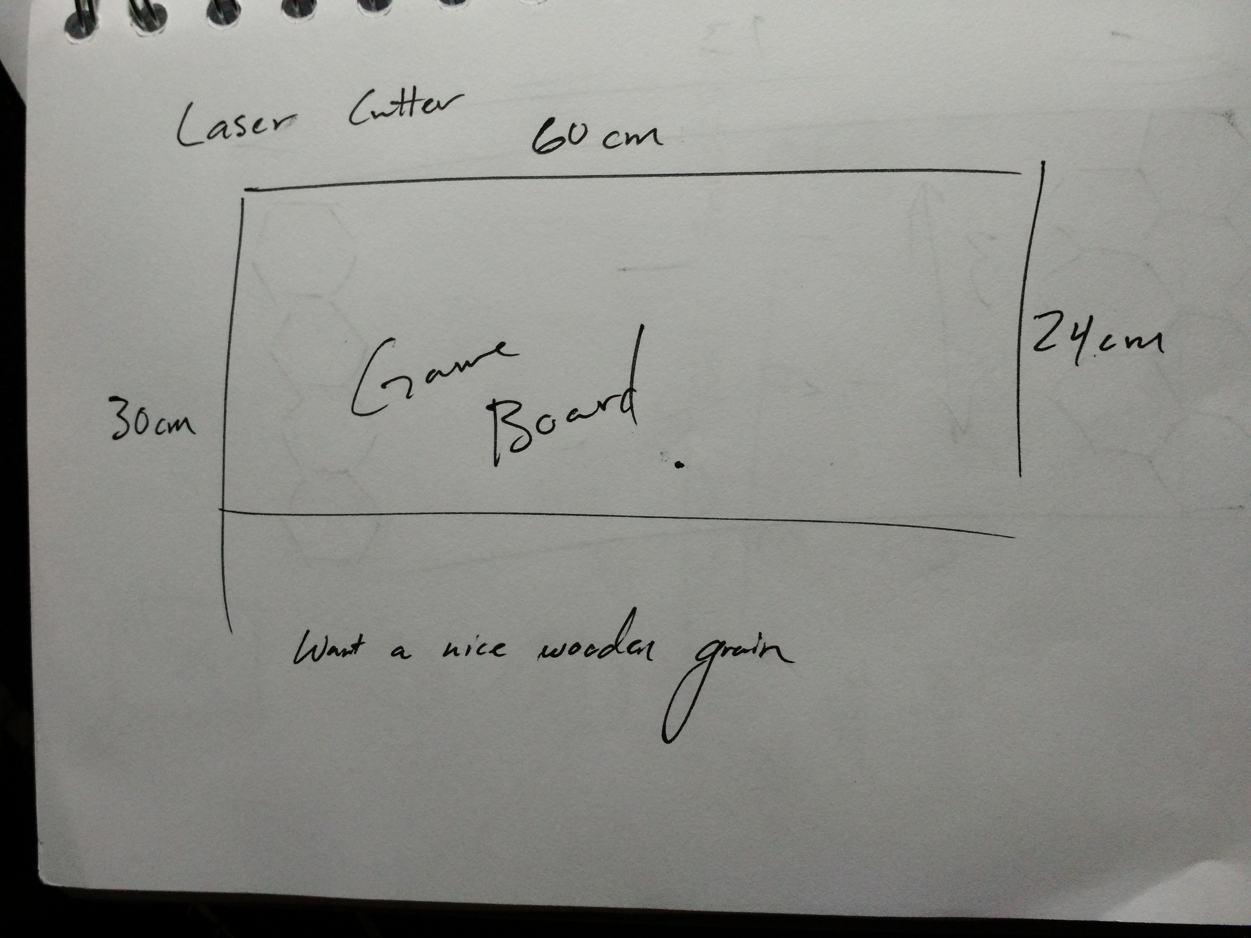
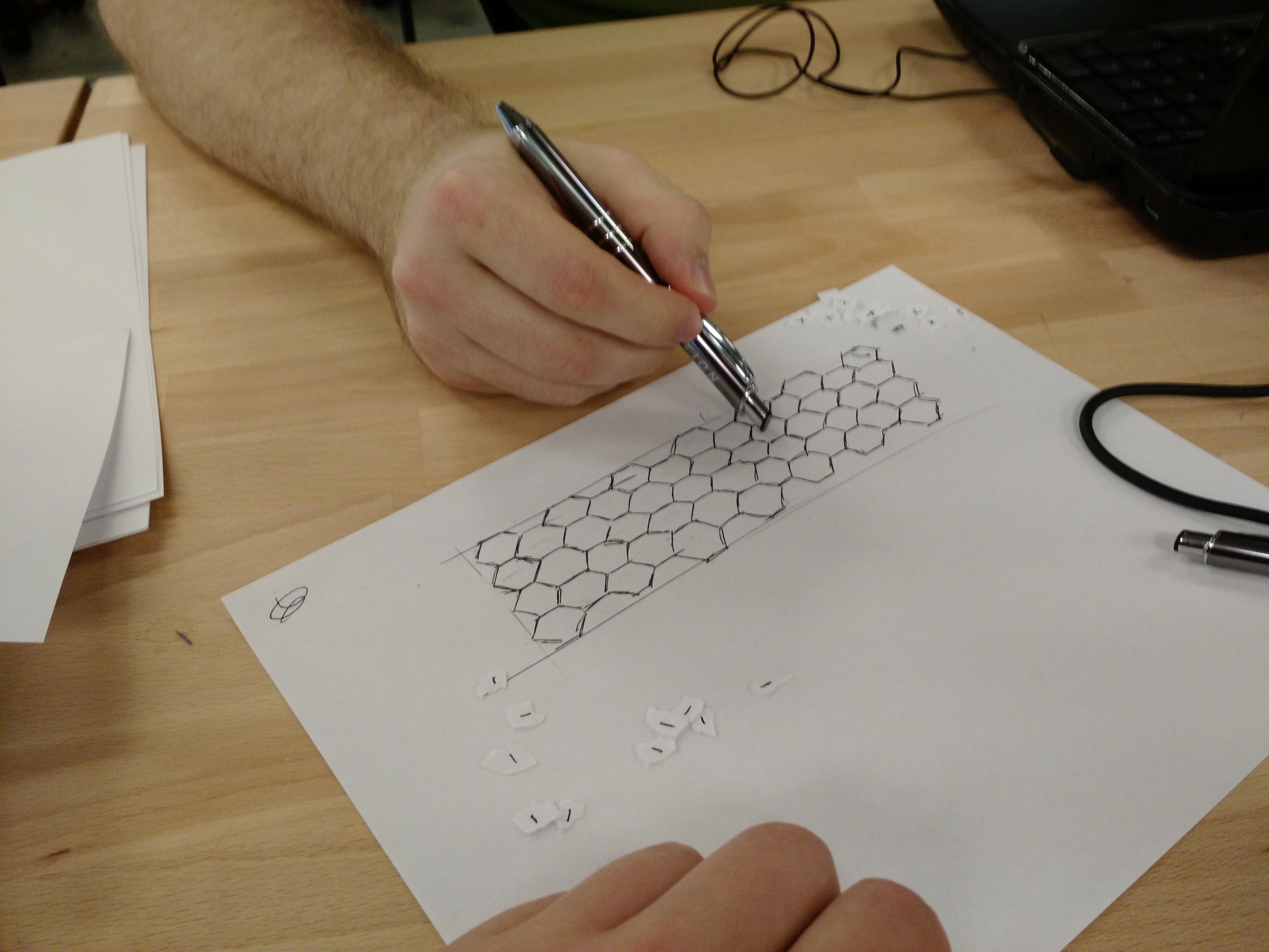
Once we had the game rules and design figured out, we began our designs on the game board. We measured the laser cutter and found that the maximum dimensions were 60 x 30 cm. We wanted a long board, so we maximized the length at 60 cm. For the width, we decided that it would be variable between 20 and 30 cm (and aimed for 24 cm). I created the board’s design in Rhino and Derek bought the pressboard to be cut as the game board.
Designing the board was a simple matter for the most part. I created a 24 x 60 cm rectangle and a hexagon within it, which I copied to make a column, then copied the column to make the rest of the board. The most difficult part of the process was positioning, as I had a tendency to miss clicking the selected objects by a few pixels, deselecting the entire group. I scaled it up using the Scale2D command (which I had not used before), leaving some padding inside the rectangle for aesthetic effect, but also to add the game’s title and our names to the board.
I also added scored circles to the resource spaces to signify them, which proved more difficult than I anticipated. Because I did this after scaling the board, the hexagons were no longer centered on integers of millimeters and I had to hunt through the various object-snap options to find a way to locate the center of the hexagon. After a lot of headaches, I ended up doing this by finding the intersection of two lines travelling through the midpoints of the hexagon’s sides, ending up with a board ready to print.
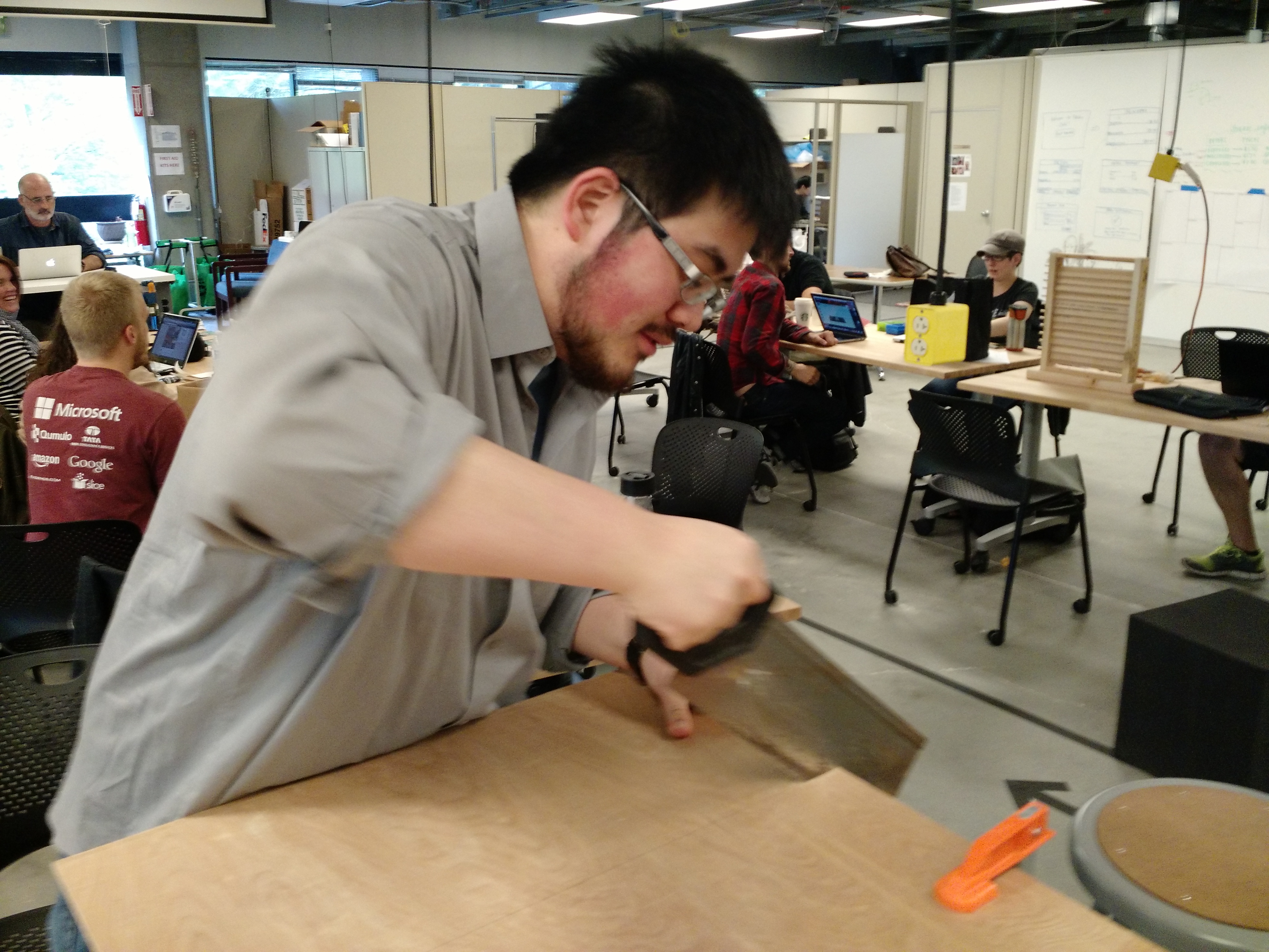
Unfortunately, the store Derek bought the board from didn’t have a working saw to cut the 60x120cm board, and there were no power saws in our class workspace. Instead, we clamped the board to the table and roughly sawed off the end of the board at the 30 cm mark with a handsaw. The Rhino design came out to be 60 x 24 cm, allowing us to center the design on the 60 x 30 cm board, discarding the rough cut edge.
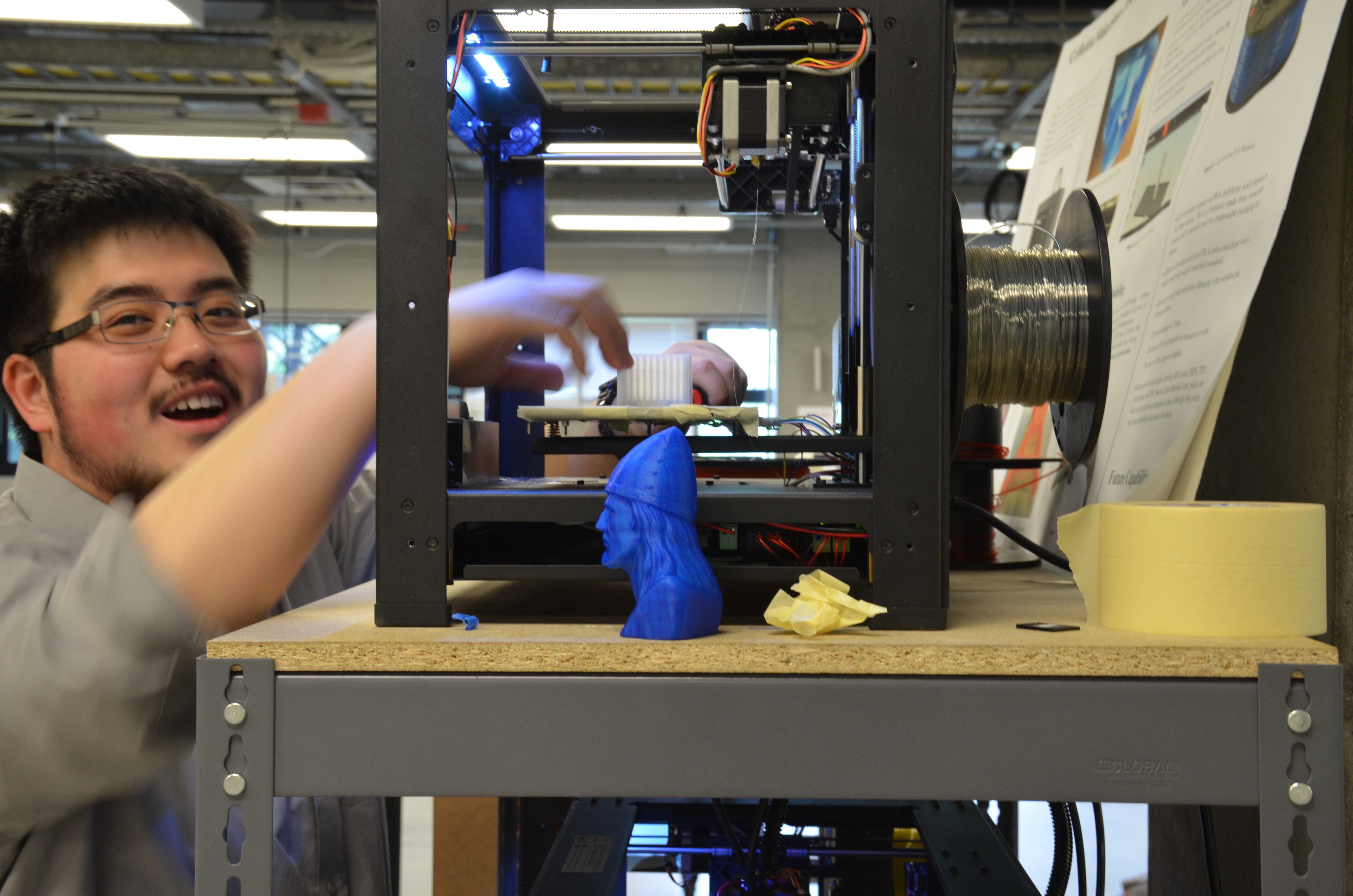
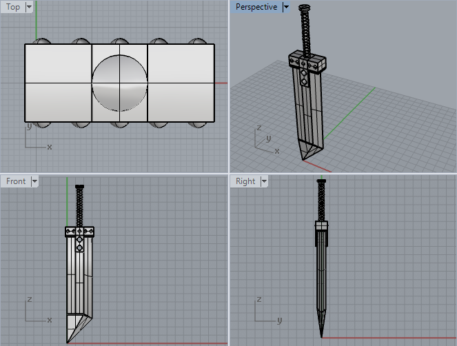
3D-Printed Trucks and Planes
The tokens for Ground Control were printed with the Makerbots that we used in the 3D Object Prototype assignment. We needed to design the trucks and planes to fit the game board with its 3 cm long hex edges.
Planes
We started by designing the planes. Initially, Derek wanted realistic-looking planes, beginning by designing a model of a jumbo jet in Rhino. However, this proved to be very difficult, so he began looking for models already created on Makerbot Thingiverse. One that he found looked exactly like what he wanted to build, so he downloaded it and scaled it to fit between 3 and 3.7 cm to fit in the hexes.
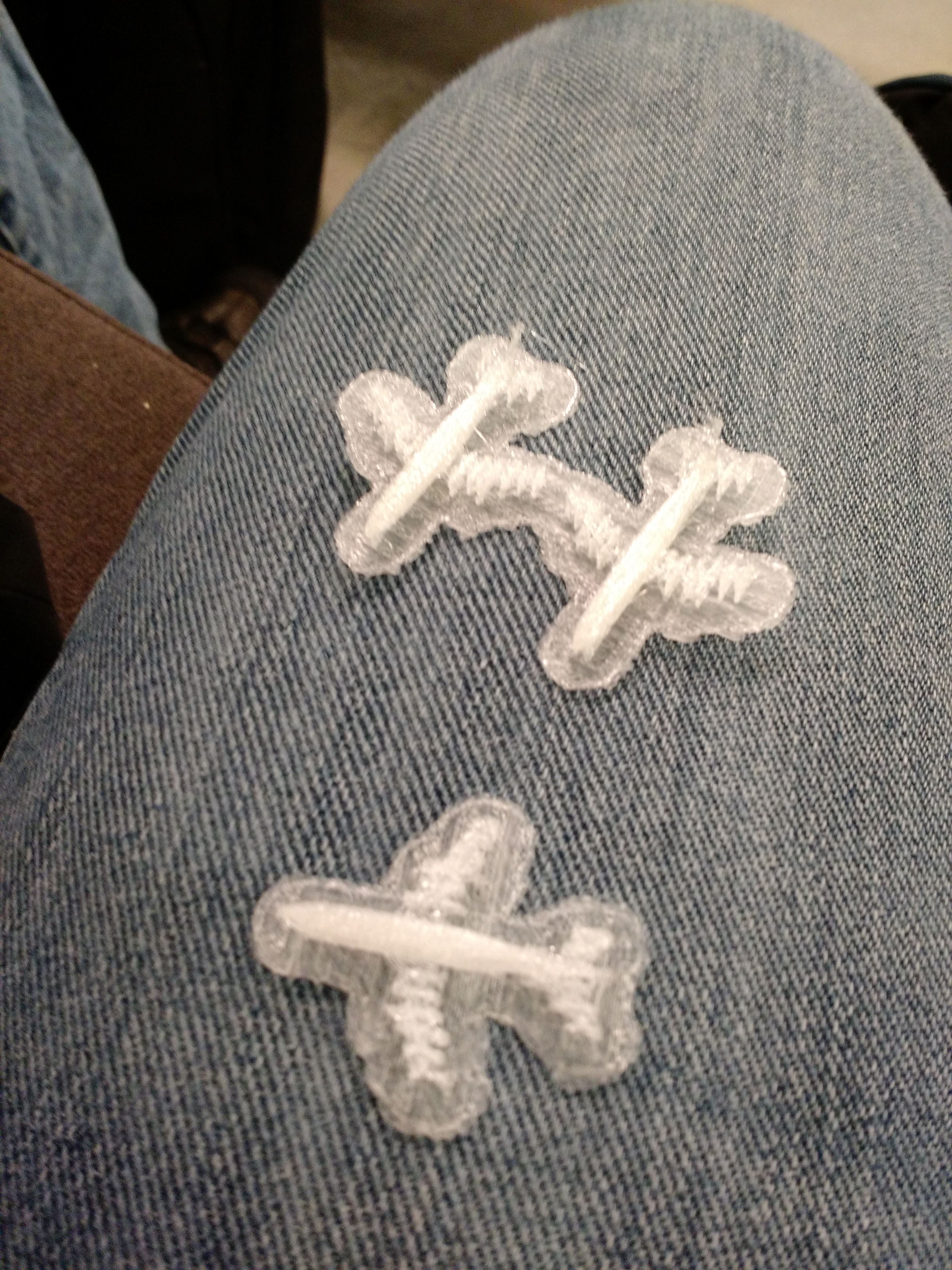
The quick print did not turn out well. The wings were so fragile that they broke off when we tried to free them from the raft, and one even broke just by touching it.
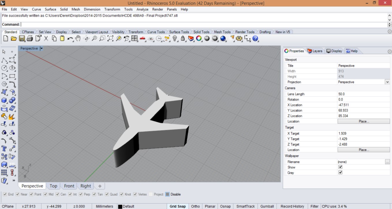
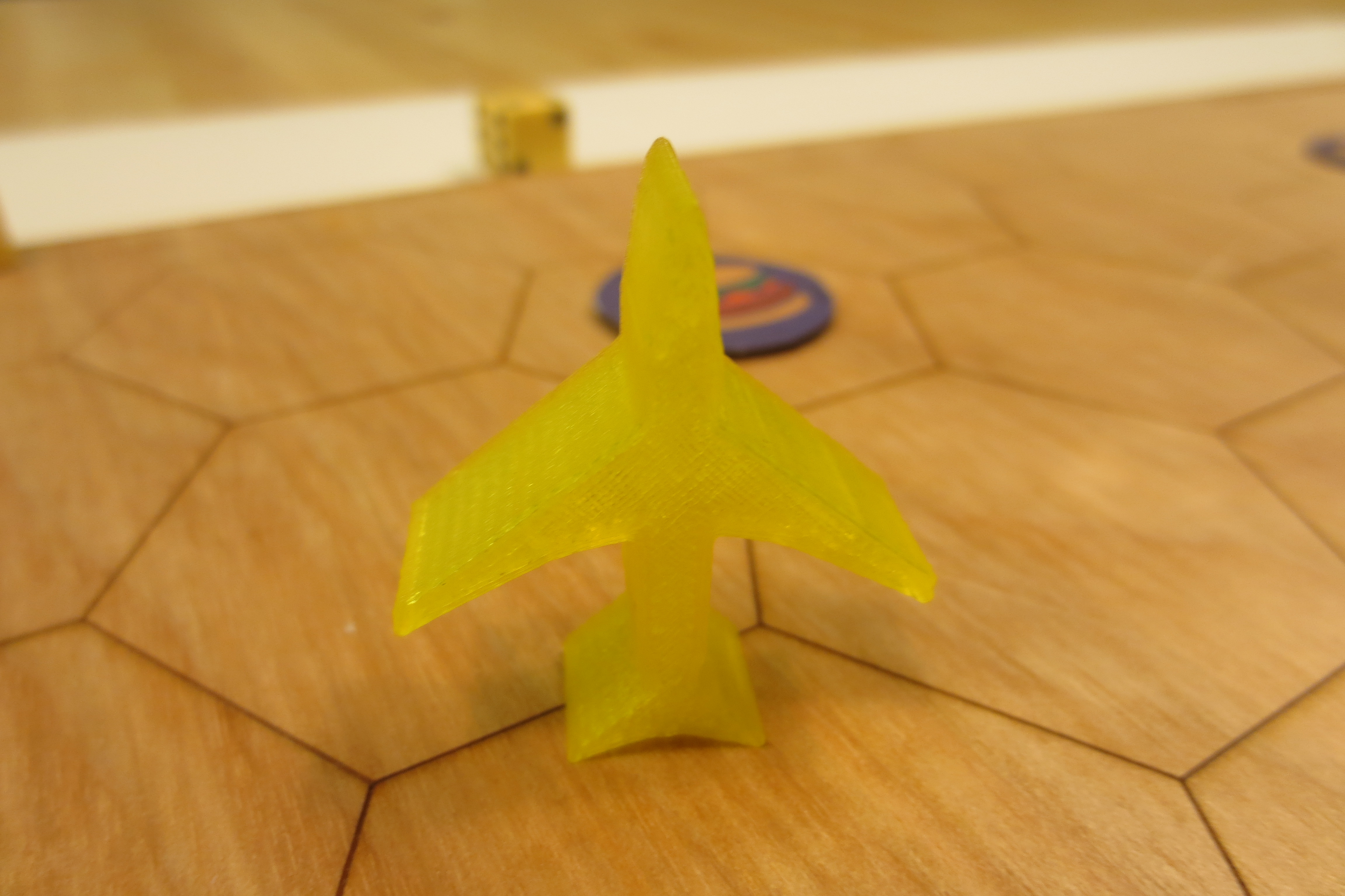
He went back to the drawing board and completely revamped the design. Like icons and signs depicting planes, he shifted to a silhouette design for the plane tokens. This design was the outline of a Boeing 747, traced, and raised to 1 cm high. With fewer parts sticking out, these tokens printed out nicely. They are immediately recognizable as planes, and are sturdy enough to hold up during gameplay.
As an added bonus, the planes could be stood up in multiple ways — laying flat, on their tail fins, and between the wingtip and either the nose or tail fin. We thought it might be an interesting way to indicate some sort of status during gameplay, but didn’t end up adding anything to Ground Control at that point.
Trucks
The small trucks were simple to design and execute, but unlike the plane, the printing itself was problematic.
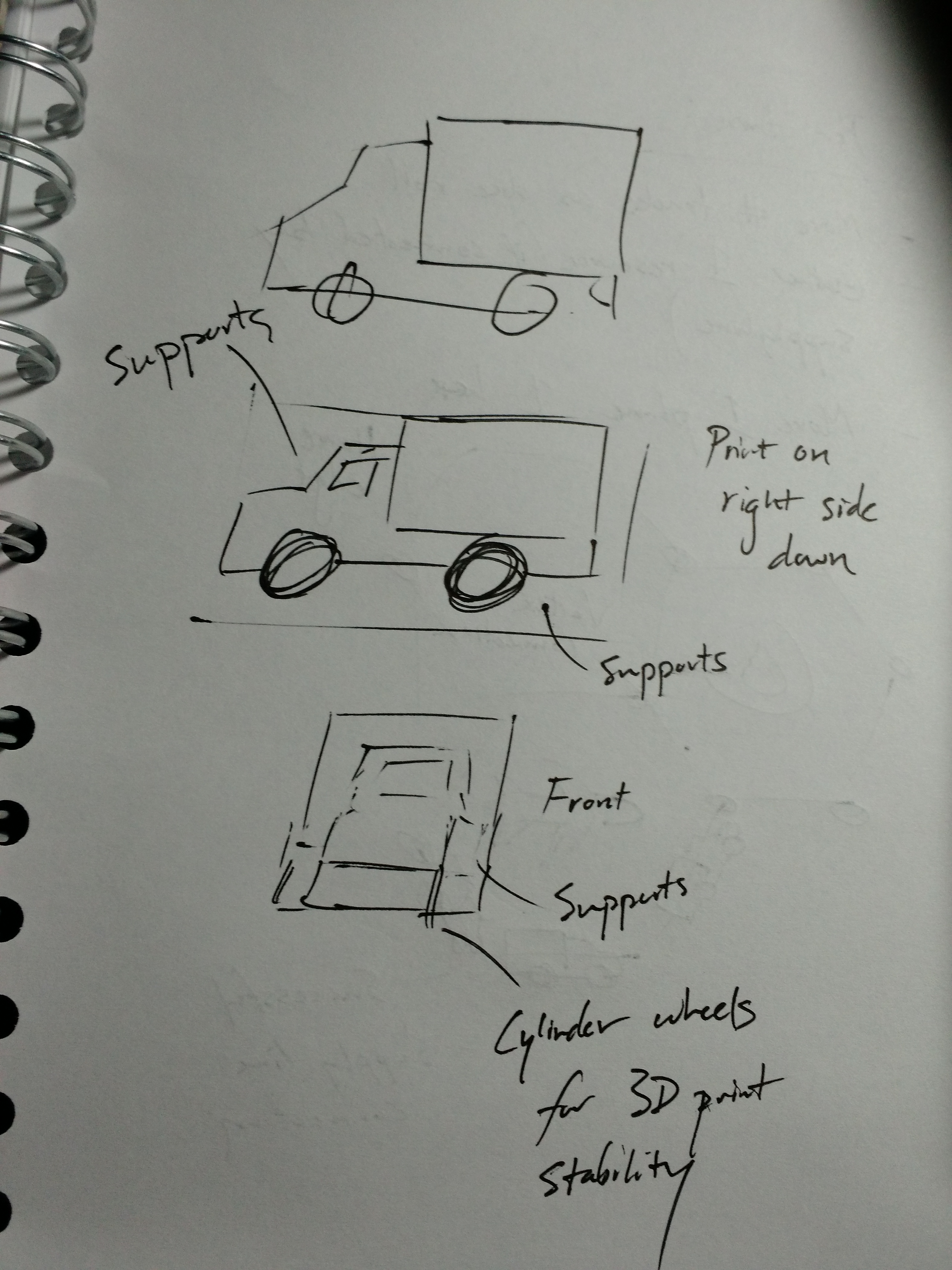
We had the design for the trucks early on. They were 2 x 1 cm long and shaped like a delivery truck. The cab was 1 mm narrower than the container end on each side, to make the truck shape immediately recognizable.
To print, we wanted to minimize the amount of supports and rafting needed. However, the cylindrical wheels meant that it wouldn’t be smart to print with the wheels down. Instead, as to maximize surface area, we printed the trucks flipped onto their right side, requiring a few supports (for the 1 mm narrowing).
Our first batch of 24 trucks was printed with both the raft and the supports. The raft made the print clean, but proved to be difficult to remove in about 2/3 of them — 1/3 of the trucks removed cleanly, while 1/3 had bits that we were able to remove and 1/3 had the raft stubbornly stuck. On those where the raft simply could not be removed, we could only sand them down a bit, leaving unsightly bulges on the right side.
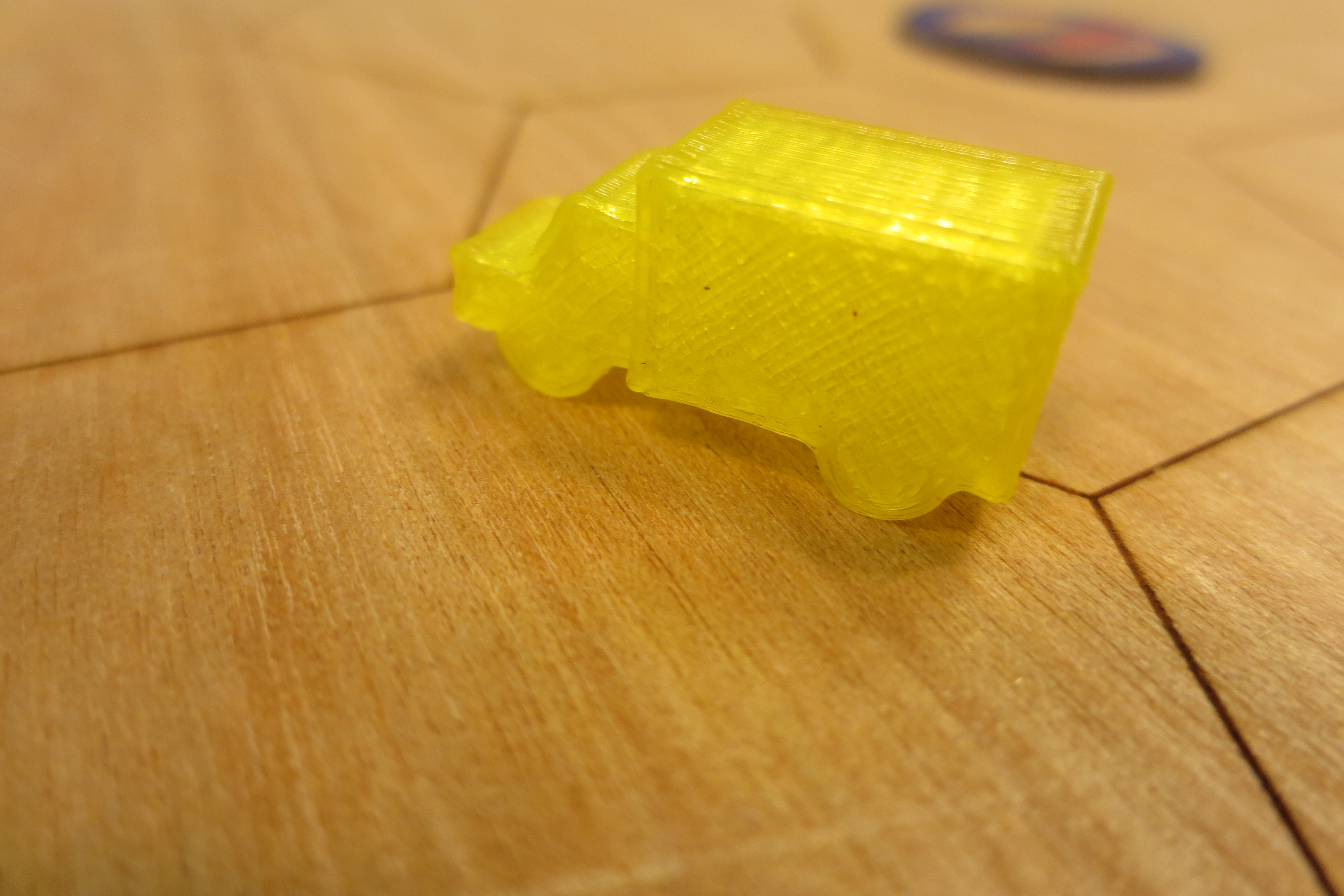
Not looking to repeat this, we decided to print our second batch without rafts, but with supports. This eliminated the problem of the raft, but introduced a new one: stringy supports. Without the raft, the supports weren’t built correctly, and without the correct supports the right side of the truck cab did not have a clean edge. This required light sanding, but still did not look as good as the first batch. Despite this, we agreed that this was still an improvement over wasting time with the stubborn rafts.
Printing woes
In addition to the issues that we faced with the 3D print designs, we had issues with the printer itself. We chose yellow for our first set out of convenience — the only Makerbot available was already set up with the yellow PLA material.
For the second set, we needed a different color. We decided to go with red; however, the spool of red material had a tangle in it, and about halfway through our print the nozzle stopped feeding material, which we only realized when the print had ‘finished’ our two-hour print with our models left open. With the Makerspace closing for the evening, we set up another print to run overnight, only for that to tangle as well. Calling the spool of red PLA a lost cause, an attendant arriving in the morning reprinted our models on a clear white PLA, which finally resulted in a successful job.
Tickets and Resources
The next step was to create the destination tickets and resource tiles.
Destination Tickets
To make the game balanced, we needed tickets that didn’t favor one resource over another. We agreed to have 25 tickets whose point values differed, but when added together, the number of resources would balance out.
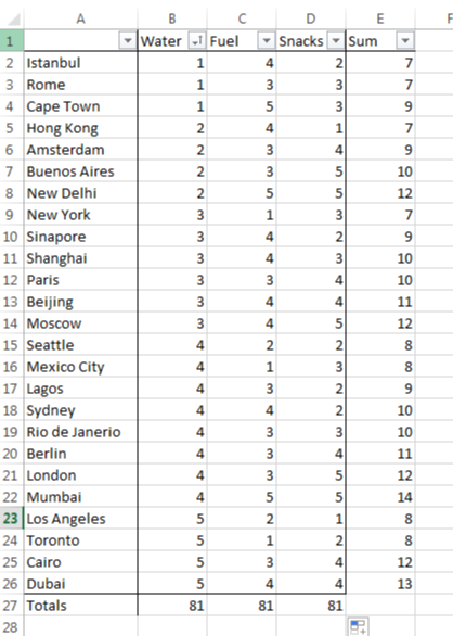
To that end, Derek created a list of 25 destinations and compiled them into Excel. Each destination had three columns for the resources water, fuel, and snacks, and a total of these three. Each column had a total at the bottom.
Once he ran a heuristic to see that there was a good spread of points per ticket, Derek went through to make sure that there were no requirement duplicates (e.g. both Cape Town and Hong Kong requiring 3 water, 4 fuel, and 3 snacks).
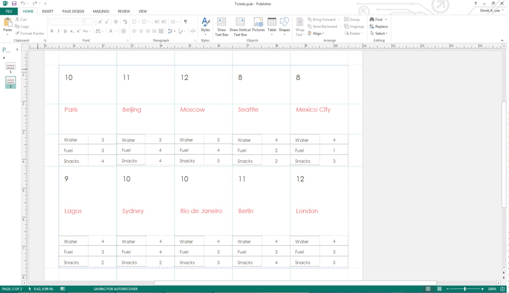
The tickets themselves were created in Microsoft Publisher, using a vertical business card template. Included on each ticket is the point total, the name of the city, and the water, fuel, and snack requirements.
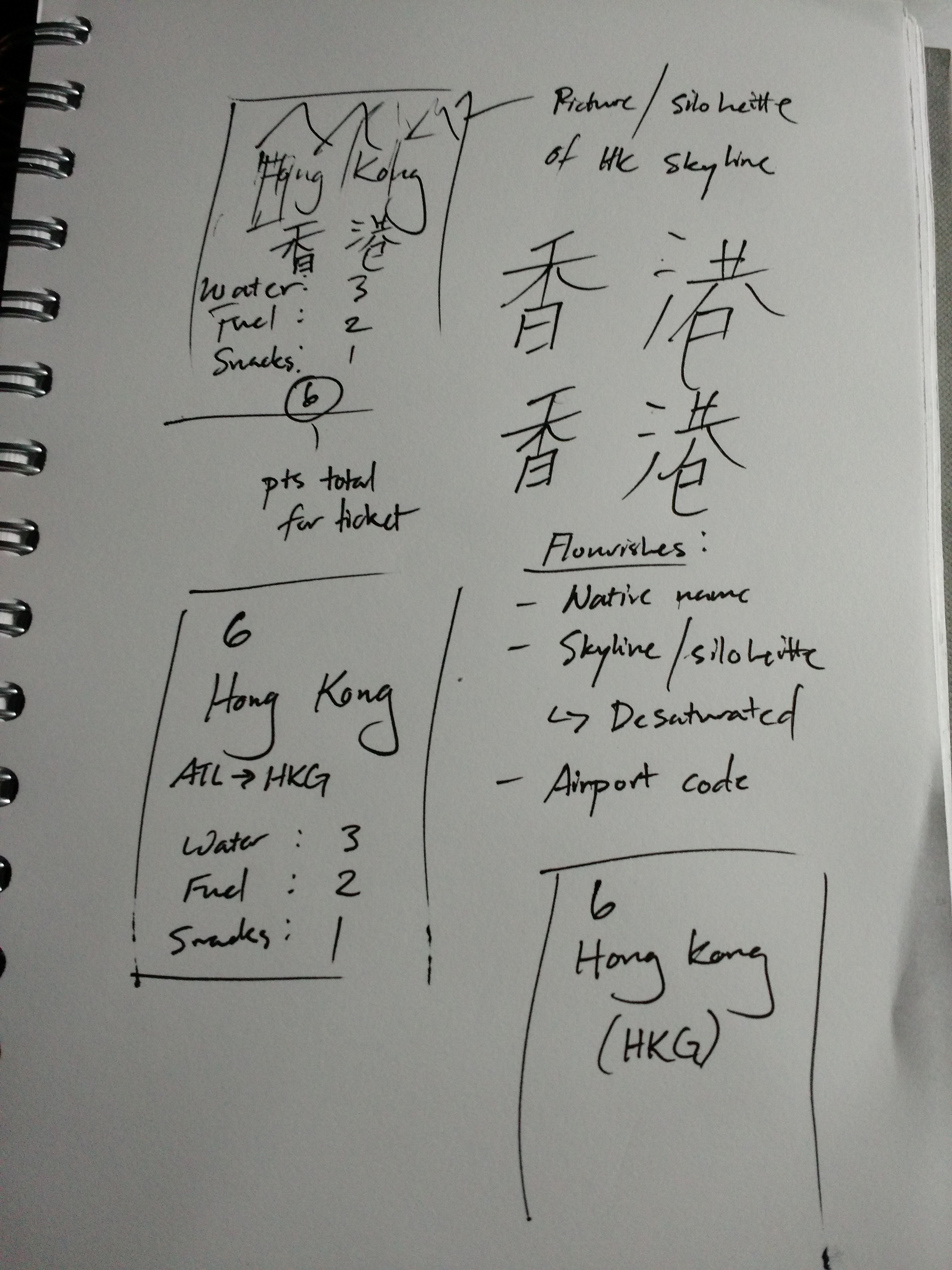
Future work would have us add more design flair to the ticket destinations. Initial sketches had us give interesting designs to the cards, such as the name of the city in the local language, the airport ICAO code, and a picture of the skyline or something that they city’s known for in the background. Unfortunately, time constraints forced us to only provide the simple design.
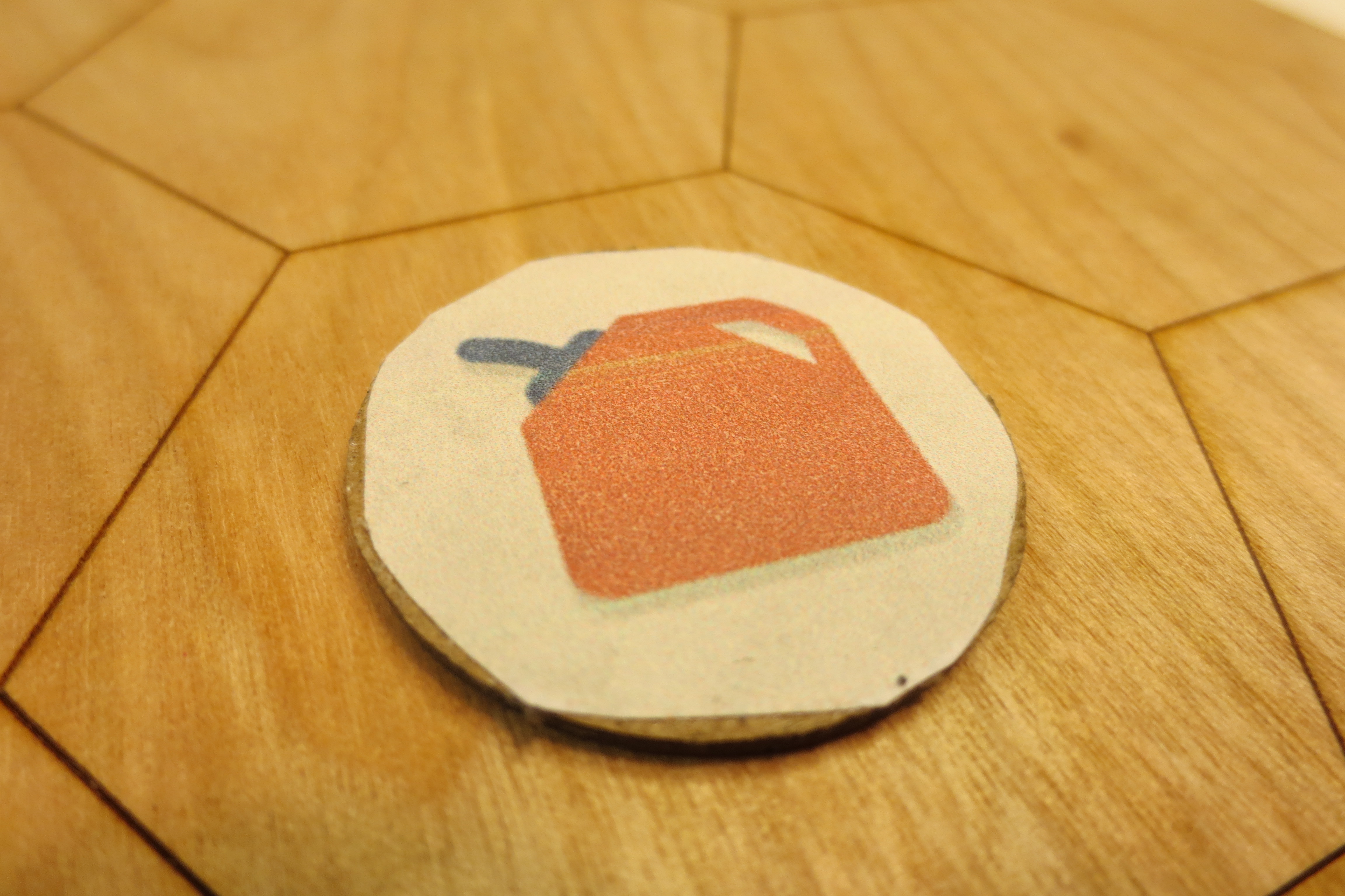
Resource Tiles
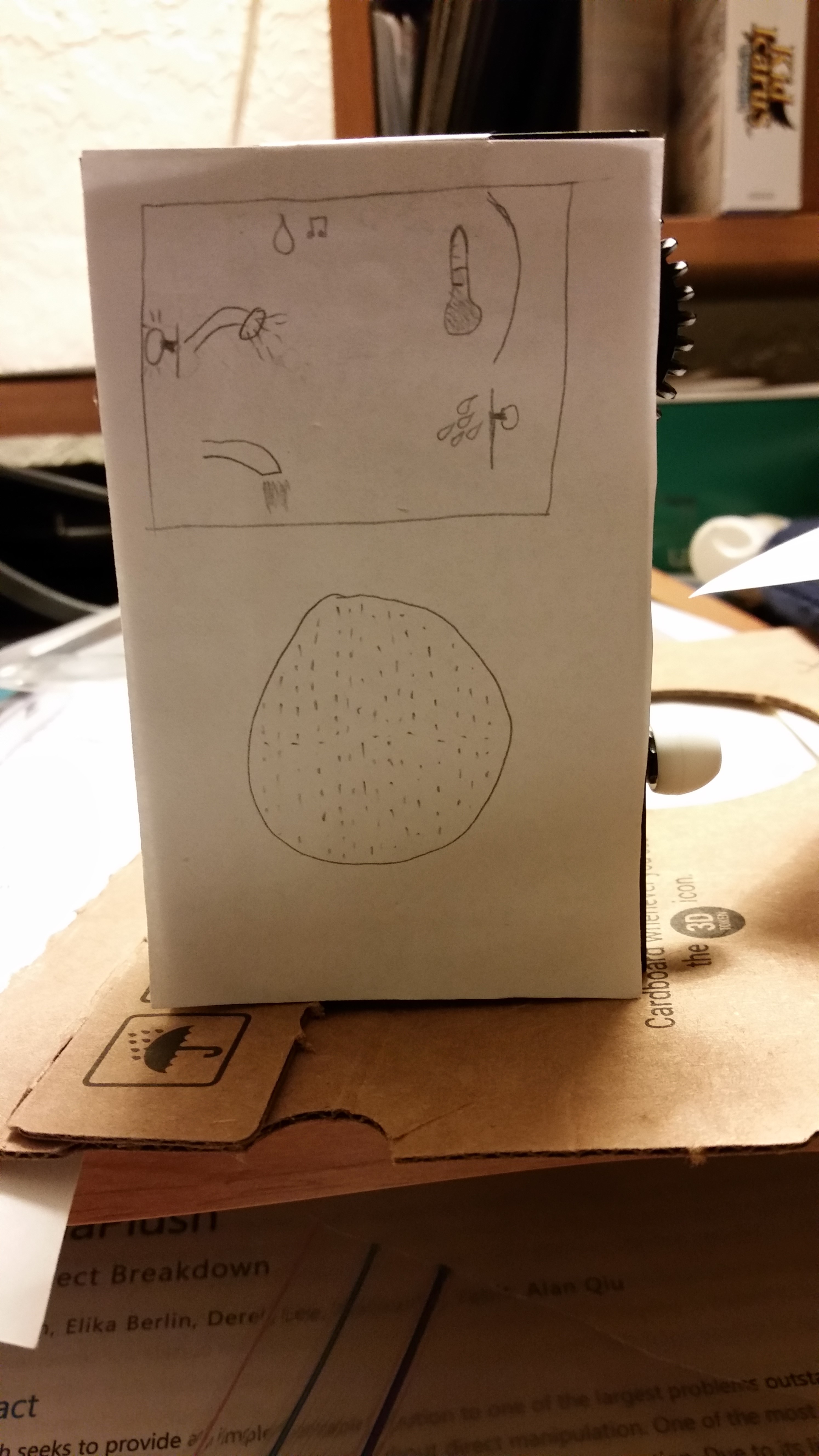
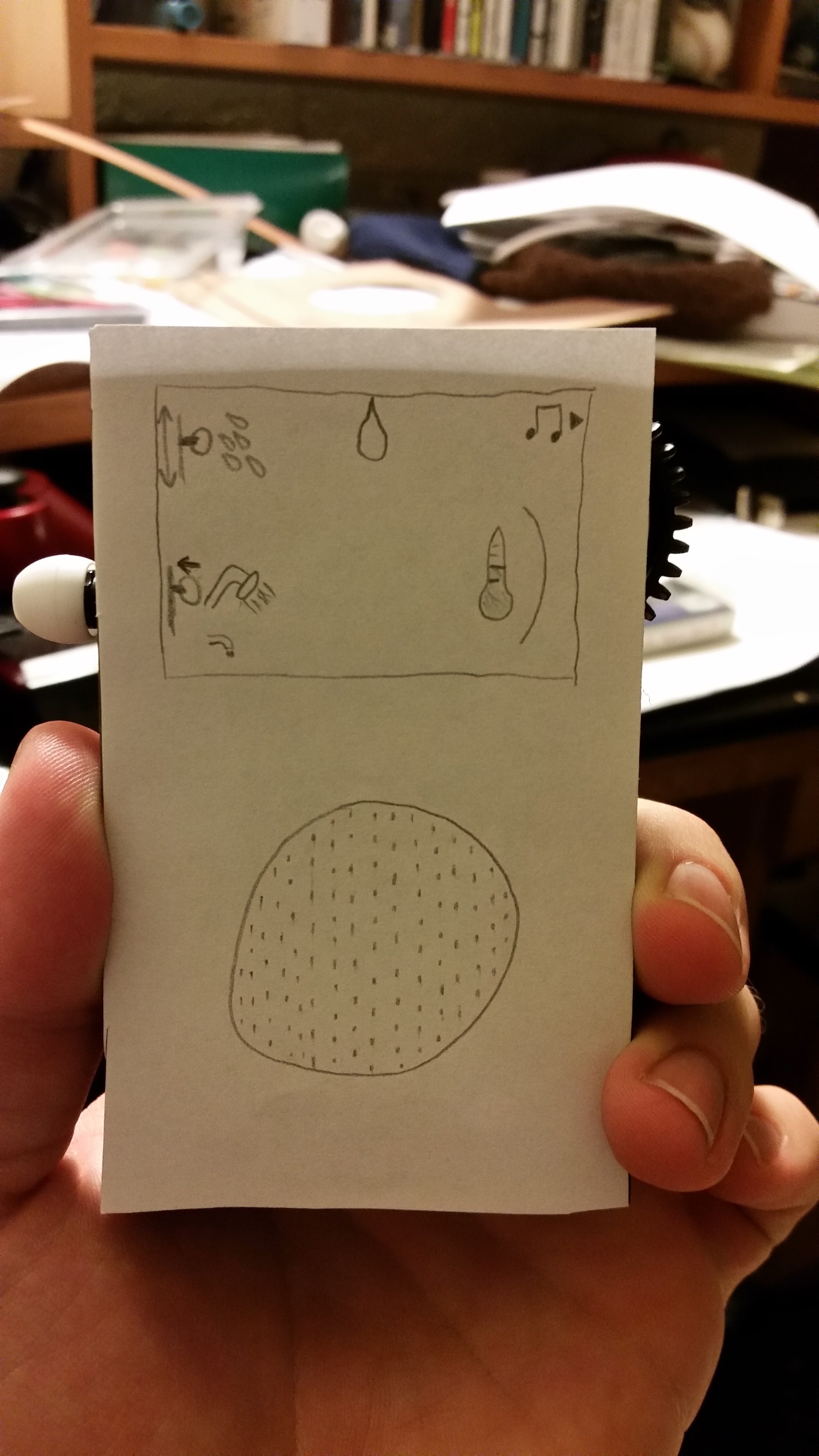
The next items to design were the resource tiles. The resource tiles would be both at the spaces and be collectible for use when taking-off and completing a ticket.
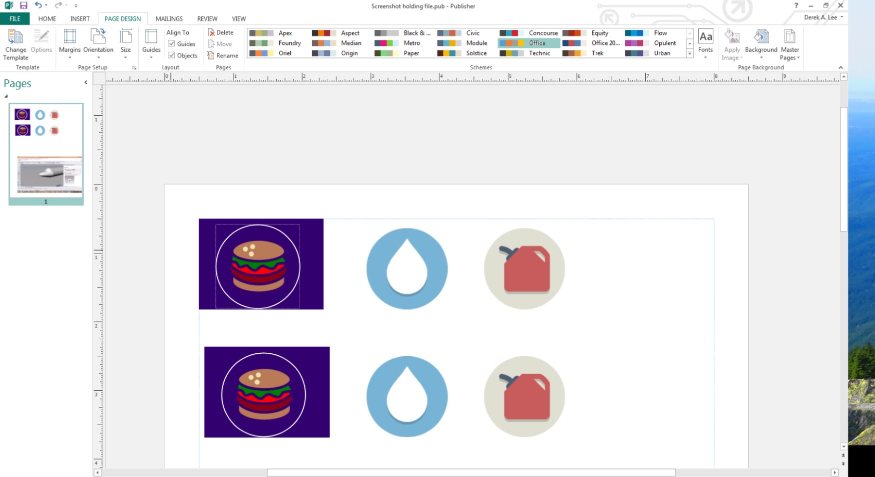
I printed off a few 3 cm diameter circles on some chipboard in the laser cutter and Derek found some free-use icons online, modifying them slightly.
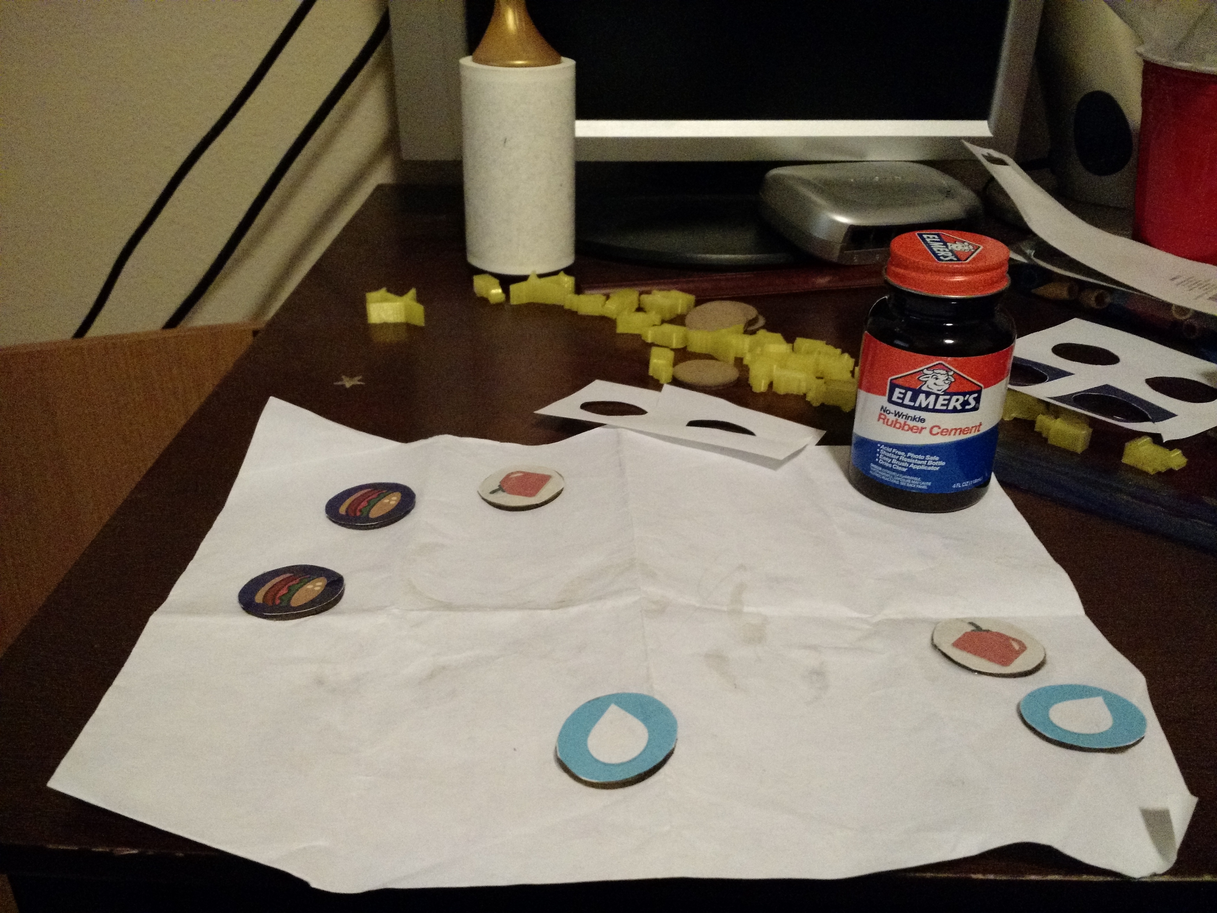
Derek printed these icons, then affixed them to the chipboard rounds with rubber cement.
Iteration and Video
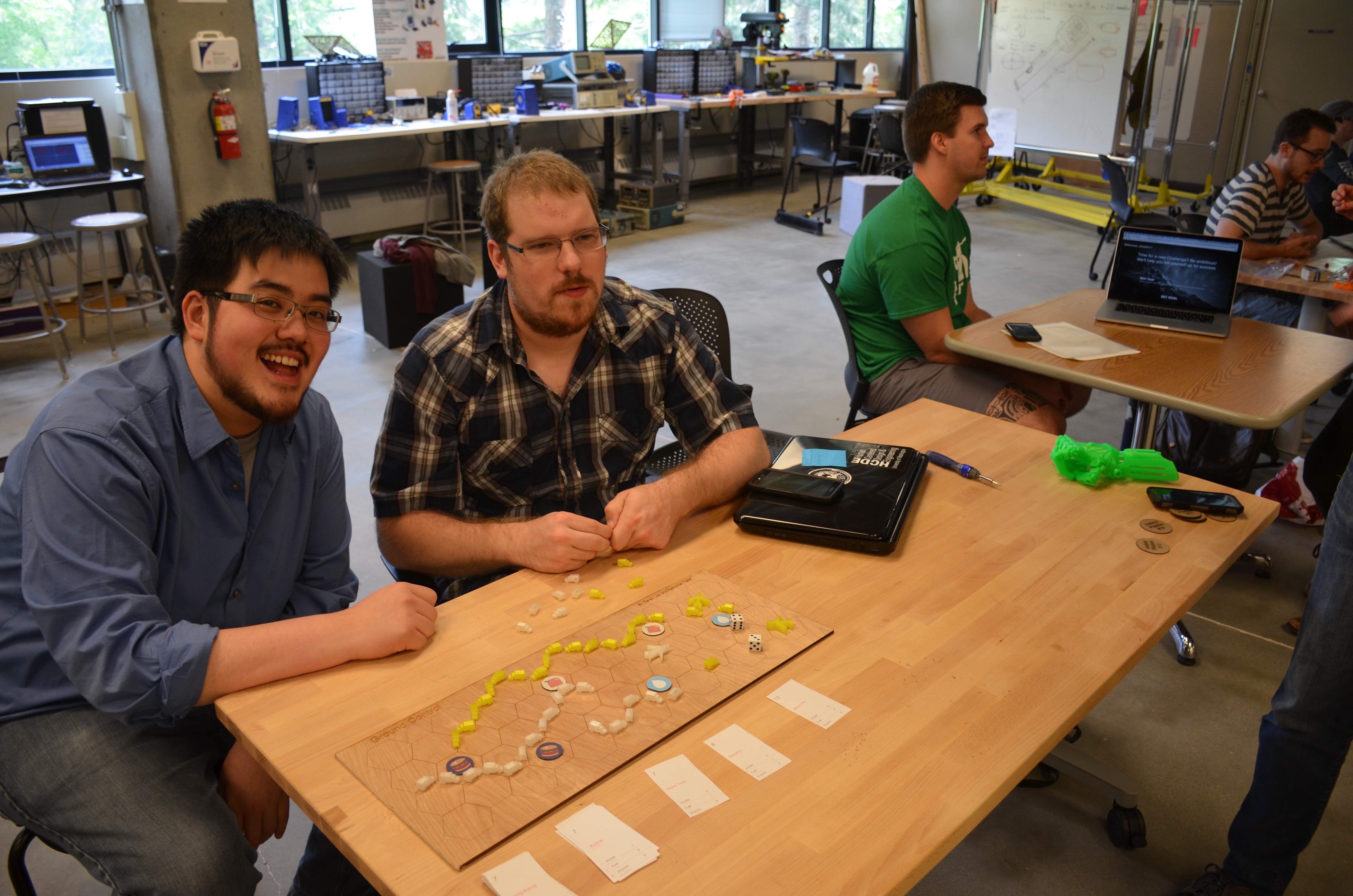
Our next step was to actually perform a user test. For us, this was quite easy — we just got two people to play our game. We were relieved to find out that our concept was good — the game was fun and enjoyable. We did record a few tweaks that affected the gameplay:
- Movement of planes equal to half of the sum of the numbers on the dice, rounded down (was originally just one hex)
- Needed more resource tiles
- Set goal to 25 points (was originally undetermined)
- Rebalance the tickets (have more variation in points per card, more unbalanced resources per ticket — some should require 0 of a resource)
Video
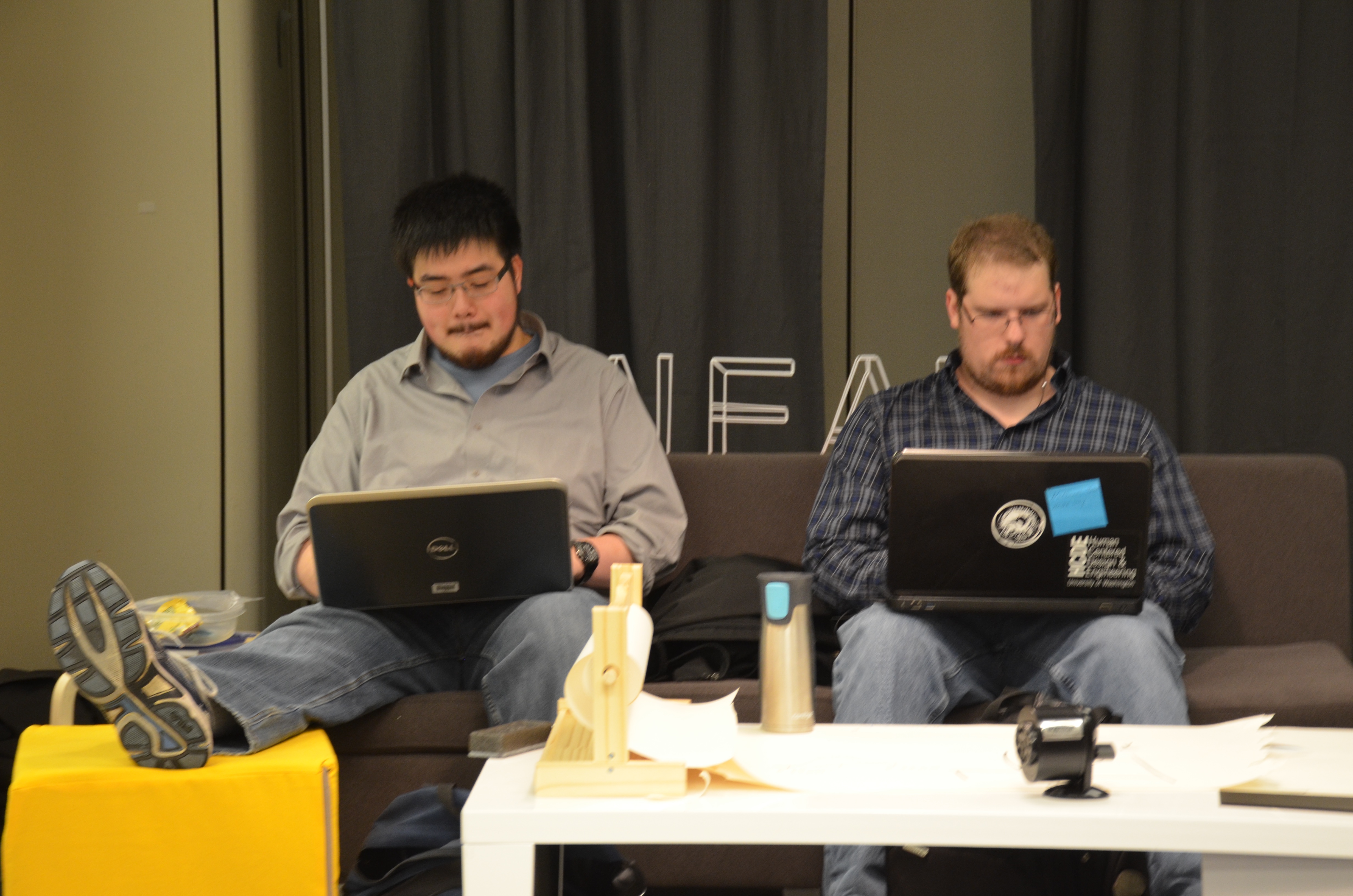
To create a video demo of Ground Control, we filmed together using equipment that we had for our capstone video and also took some promotional pictures of the game board. We did primary shots of different game actions, such as redeeming a completed ticket once a plane takes off, moving trucks for the supply line, and gathering resources.
Unfortunately, time constraints meant that the filming was all done the afternoon before the video was due. While Derek wrote up a final report on the project, I wrote the script, provided the narration, and did all the film editing on iMovie, bringing the 10 minutes of footage to fit into a 60 second time limit. Unfortunately, the pop filter I used with my microphone for voice acting was broken, making some of the harder consonants of his narration sound rough. My voice had also become raspy by the time I had the opportunity to record the lines, making my vocal control tenuous at best. At 5:30 AM I had finished editing the demo, just in time to get ready for the school day.
Lessons Learned
Derek and I had a fun time working together and on Ground Control. Although designing a board game, dealing with weird 3D prints, and having to use handsaws to cut boards is not easy, we had a good time doing so. It provided a nice relief from our capstone project for us.
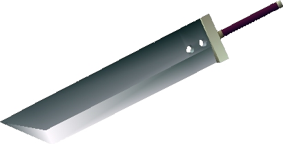
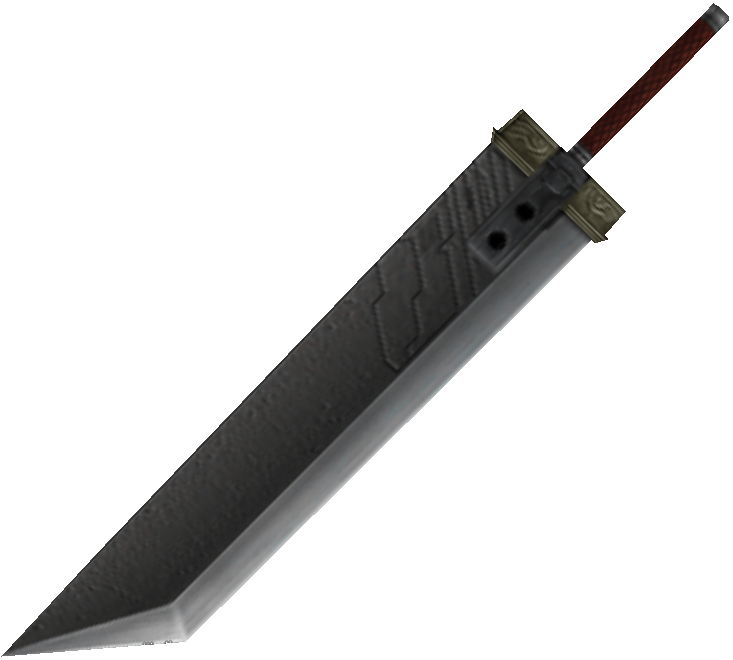
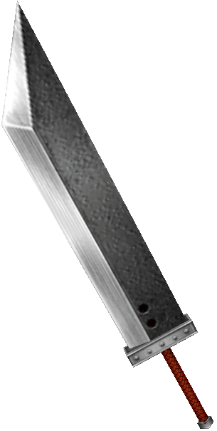
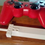
One major thing that we learned was that 3D printing is still new and developing. While my Buster Sword printed out nicely and removed from its raft with ease, with Ground Control, we learned that size matters. 3D printers choke on small objects like our planes and trucks.
While it wasn’t quite a lesson learned, trying to edit a video overnight resulted in a lesson reinforced. It is no small or easy task to make even just a one minute video, especially without all of the tools prepared beforehand. Looking back, I’m not sure if it would have been possible to schedule this any better than we did, but that doesn’t stop it from serving as a reminder for any video work done in the future.
Thank you for reading!
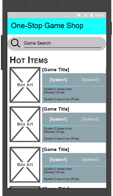
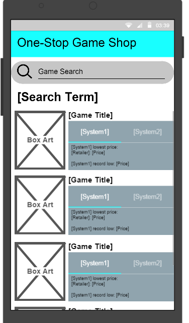