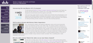
Having finished our Wizard of Oz prototypes, the class began work on creating wireframe redesigns of the UW’s dub website. Dub is a cross-campus group that focuses on Human Computer Interaction and Design, however it has been years since their site has been updated, let alone designed, making it a great sandbox to practice wireframing in.

I chose to create my wireframe in Axure, a program designed to create prototype systems of varying fidelities. Being a wireframe, most of the content on my design would be placeholder, from images to text. The only actual written text on the page was either used to describe what the placeholder was holding the place of, or as headers for the various parts of the page.
Looking at the current layout of the dub site, one thing I was struck by was that the only thing updated in the last year or more was the automated twitter feed in the right margin. I decided that since this would provide for a steady stream of effortless content, I chose to keep it in my redesign of the site. The rest of the site’s design was based on a mixture of the things already found on dub and the assignment’s requirements.
We were given announcements, directory, calendar, seminar, research, and membership as required content, and going through that list I noticed that the only thing the current dub site has that this didn’t cover was the blog, which I didn’t consider an entirely bad thing. A lack of updates on the blog was the first sign that the dub site was in trouble, and even if other parts of the site are being updated the empty blog gives users the impression that the site has been abandoned. Losing the blog may have removed a front-and-center place to put a specific kind of content, but that content could either be posted on personal blogs and linked to in the Twitter feed, or put in the blogger’s page in the directory.
With the headings decided on, it came time to design the content of individual pages. Lining the page up with a 12 column 960px grid, the first thing I did on the main page was put an ‘About’ blurb at the top of the content area. This was a section that was noticeably lacking on the current dub page, which was made apparent to me when I found out from one of their contributors that I, at the time, had a fundamental misunderstanding of what dub was. Underneath of the About section I wanted to put easy to notice windows to what would likely be the two most often referenced parts of the site: the announcements and calendar.
Designing the rest of the pages was a fairly straightforward process, as I only had to create placeholder content to fulfil the needs of that page. This became slightly more complicated with the seminar and research pages since there were multiple types of information that needed to be conveyed through them, but I found that I could easily break those pages into four different subjects to explore within the topic.
The final design for my wireframe can be found here. After creating it, I noticed several strange issues with the way the page looked. First was the fact that it seems like the font in the published version of the wireframe is different from what I was viewing in Axure, as some text is now much larger, expanding out of their containers. The other issue is that while in Axure the Twitter feed bar had scroll buttons on it to indicate that there was more to be found than just the tweet and a half, those disappeared with the published version.
In the end, I found my experience with wireframing to be educational, but my time spent with Axure was frustrating. As a web developer with several years of experience, I couldn’t help but feel like I was taking the long way around by using the supposedly ‘rapid’ prototyping tool, especially considering the inconsistancies between my local and published versions. I went into the assignment knowing it would be slower since I would have to learn new software on top of designing the site, and I obviously still have a lot to learn about the software, but I still feel conflicted about whether it is worth giving up the power of commanding the computer through code, even if just for a prototype.
Thank you for reading!