Our first assignment in the class was to design and create a paper prototype for an app that makes use of both a smart phone and a smart watch, such as the Pebble or the Apple Watch.
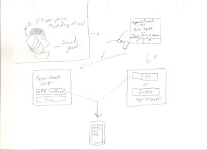
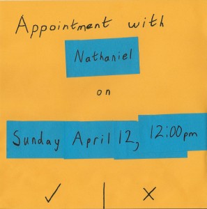
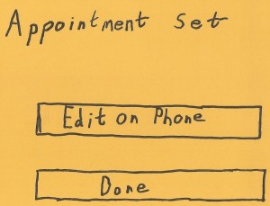
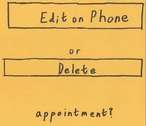
As someone who has been trying to make better use of the calendar functions on my phone, I thought it would be fitting to design an app that would help facilitate that. My design has an app running on the watch and phone listen to calls being made for specific dates or times mentioned by either person, and then puts together a calendar event for those times. It gives the user the option to approve or deny the offered appointment, and if the user approves, asks if they would like to edit the appointment on their phone, or finish with the process. A similar screen appears if the user declines the appointment, with buttons to edit the offered appointment on your phone or to exit without creating a calendar event.
Based on this design, I created a paper prototype of the app as it would appear on the user’s watch. I wrote post-its for any variable fields, allowing for some differences between test sessions, though for the sake of time and resources I limited the options here to a single week in April (Sunday the 12th to Saturday the 18th).
My testing of the system went very well, with users intuitively knowing how to interact with what they were seeing. One tester commented that he found it strange that both confirming or declining the offered appointment gave them the ability to edit the appointment’s parameters, though he did also say that he could imagine himself in circumstances where he would accept the appointment and want to add details, as well as situations where the offered option was far enough from what he wanted that he did not want to go with it, but would want to edit it.
One thought that crossed my mind was that it may be helpful to have the first screen have accept and reject buttons, but also an edit button, which removes the need for the other two screens altogether. My one worry with this option would be that we would run out of real estate on the watch screen, since they are so small. This is something I would have to explore in further testing were I to continue with the project.


